
Forms Framework: Handling Commerce Cloud Forms
Introduction
Salesforce Commerce Cloud Digital provides tools to simplify form display and processing. Use the Digital Forms framework to control how consumer-entered values are validated by the application, rendered in a browser, and possibly stored on a server.
To use the DigitalForms framework, you need the following files:
An XML form to define and store the metadata
A Controller that will validate and process the form
A resource bundle (.properties) file that contains externalized form labels and possible error messages
An ISML template that will display the form to the user
There are a few objects that interact with each other when working with Digital forms:
XML metadata file: located in the cartridge/forms/default directory. It describes the fields, labels, validation rules and actions that apply when the field is used in an ISML template.
ISML template: it uses the form metadata fields and actions to show an HTML form to the user.
Controller: Renders your template and also processes your form data when you submit it
Resource Bundle: Contains the labels and titles that you display in your form
Object (optional): this object represents a single system or custom object in the pdict, and it can be used to pre-fill the metadata file as well as to store submitted form data to the database.
XML Metadata File
Identify the fields that a user will need to enter, and what actions can be taken when implementing a form.
This information typically comes from a wireframe or a functional specification. Once the form fields are determined, create them in an XML form that will set the form field parameters and hold the data for the form.
This table shows all elements that can be used in your XML form file e.g signupform.xml
Element | Description |
|---|---|
form | Required: top-level tag that contains all other elements inside ... |
field | Required: Defines data field with many attributes (see table below) |
options | Use as a child element inside a field to pre-fill multiple options like months, days, etc. |
Option | Use as a child element inside an options element to specify a single option |
action | Defines a possible action the user might take on the form |
include | Allows inclusion of one form metadata definition into another |
list | Allows inclusion of several items (i.e. the collection of addresses) as a single field |
group | Allows grouping of elements to be invalidated together |
The field element may use the following attributes:
Attributes | Description |
|---|---|
formid | Required: unique ID to identify the field for ISML templates and controllers. |
type | Required: data type for field (see table below to check accepted values). |
range-error | (*) Message shown if value provided does not fall within the specified range. |
parse-error | (*) Message shown when the data entered does not match the regex. Usually a key to an externalized string. |
value-error | (*) Shown if an element is invalidated in a pipeline. |
missing-error | (*) Message shown if the primary key validation error is generated in a pipeline./td> |
label | Usually a key to an externalized string in the forms.properties resource bundle. |
regexp | Regular expression for string fields: email, phone, zip code, etc |
description | Description for field, might be used in tooltips. |
mandatory | The field is required via server-side validation when true. |
min, max | The valid range for integer, number, and dates. |
min-length, max-length | Restricts the field length for data entry. |
binding | Used to match field to a persistent object attribute. |
masked | Specify # of characters to mask. |
format | The format for display of dates, numbers, etc. |
whitespace | Specify whitespace handling (none or remove). |
timezoned | Optional flag for date objects (true or false). |
default-value | Pre-defines a value for a field. |
checked-value | Value when the field is checked in a form. |
unchecked-value | Value when field is unchecked in form. |
There are 4 types of error: range-error, parse-error, missing-error, value-error. And 2 required attributes: formid and type. For definition read the cell that contained the sign (*).
Data type to be used for the "type" attribute on <field> element can be as follows:
Data type | Description |
|---|---|
string | Use for text data. |
integer | Use for numeric data like days, months. |
number | Use for quantity fields. |
boolean | Use with multiple-choice fields. |
date | Use this when timezoned or format are needed for dates. |
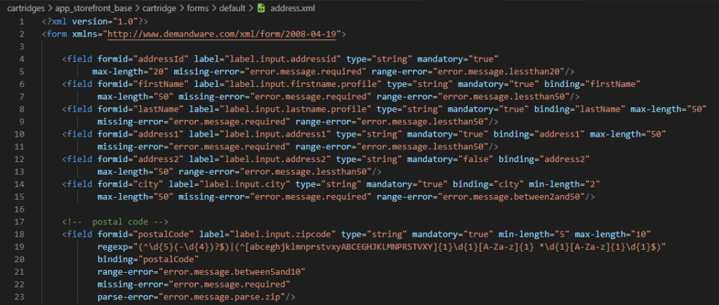
part of the metadata definition of the address form
In this example, the fields firstname, lastname and others store some of the information needed in the user profile. You will notice that some fields are mandatory because of the attribute mandatory="true".
Also, all of them contain label keys that point to the cartridge/templates/resources/forms.properties file (by default, labels used on forms are defined inside this file)
Finally, the postalCode field has an extra requirement. It uses a regular expression (regexp) to define what an acceptable postalCode can be and it specifies a parse-error key that matches an error message in the forms.properties file.
The action tag, when present, identifies the possible actions that a user may take on the form and the attribute valid-form="true" in this tag means that this form requires validation: the mandatory fields will be enforced on the server-side.
ISML Template
Define an ISML template with the same tags needed for a valid HTML form: <form>...</form>
You can implement your own form action by specifying a controller URL, but that would circumvent the Forms framework.
<form action="${URLUtils.url('Controller-Function')}" method="post">
    ...
</form>
The method URLUtils.url('<Controller>-<Function>') will call the specified Controller and function once the submit button defined for the form is pressed.
There is also another method, called URLUtils.continueURL(), which ensures that the form gets submitted back to the controller that displayed the form template.
SFRA uses the input tag for the creation of form fields.
Below you can see part of the addressForm.isml template file.
Watch out for the form attributes as action and method:
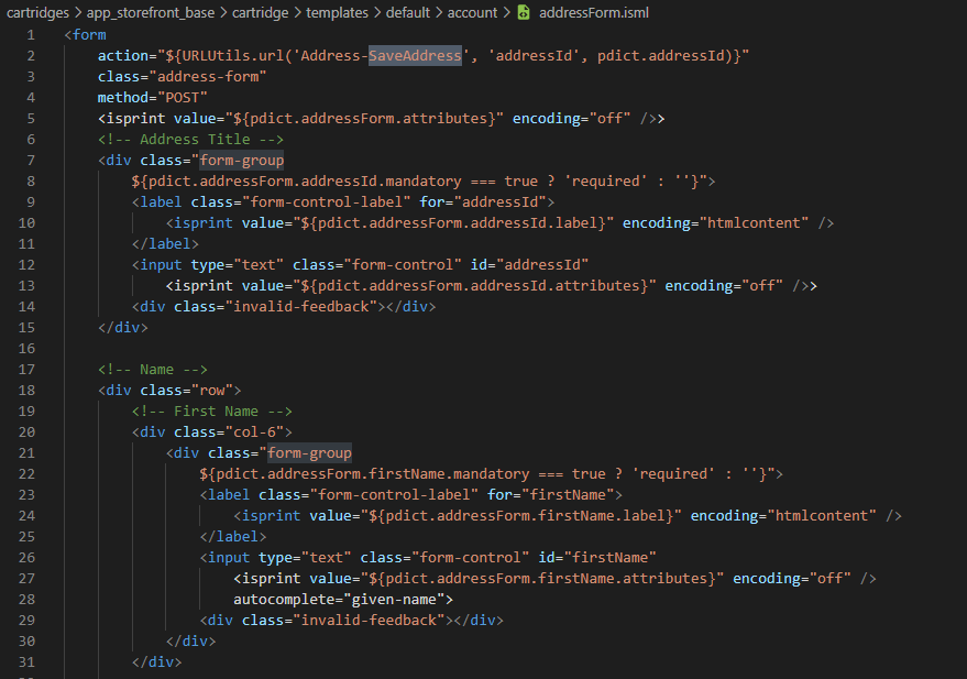
Address form isml example. Salesforce Commerce Cloud
Controller
There is usually a controller behind the scenes which is responsible for rendering the template file and also sending the form object to it.
Below you can see part of the Address Controller file:
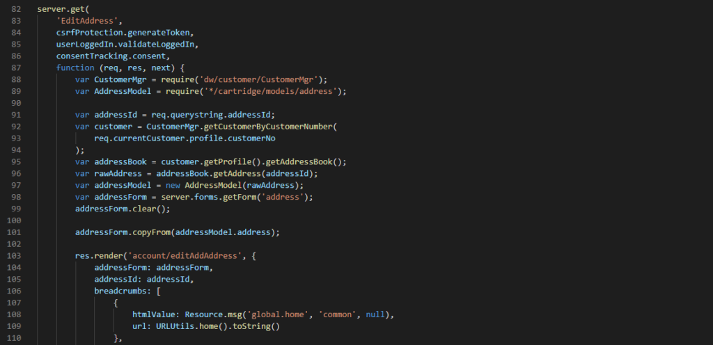
Edit address controller. Save form data in SFCC
As you can see, the controller, does the following:
Retrieve address ID from parameters that were sent to the function call
Retrieve the customer data (lines 92-96)
Create a model (line 97)
Create data from the form object from the current session using the metadata file definition(line 98)
Clear an existing form object in the pdict using a specified form metadata file. (line 99)
Populate the form object with the data retrieved from the API (line 101)
Renders the template file (line 103)
Sends values / objects to be used in the template (lines 104 and 105)
Resource Bundle
By default, all labels, messages and titles that you will use in your forms should be added inside the <cartridge>cartridge/templates/resources/forms.properties
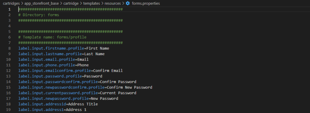
route:beforeComplete event
The callback function for this event its executed before middleware completion. Official Salesforce Commerce Cloud docs says "The route:BeforeComplete event is used to store form data. Different APIs are used to save data, depending on the type of form."
In practice, this is not mandatory but at least you know it is a possibility if you have a specific situation where you have to save form data, you expect the endpoint to be extended and you must make sure that your logic to save the form data will be the last part to be executed.
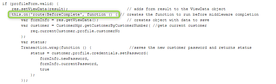
route:BeforeComplete event